Extended Task
For the extended task I chose to go into more detail on the week three visual design task. This was an activity I specifically enjoyed as I have always had an interest in graphic design but never knew where to start. With the simplicity of Canva it allowed me to test my creativity and have a go at creating my own adverts and posters and after wanting to explore it further in the seminar I knew it’d be the right task to continue with. I chose to follow three of his laws and create digital work that could reflect what I had learnt about his theories.
As I looked further into Gestalt Theory I found that a key aspect is that the larger project holds greater importance then the individual elements, with each small detail adding to the greater picture. This was something I noted as from then on with my piece I only added elements if it would benefit the final product, making the process a lot simpler as I no longer wasted time on the smaller things.
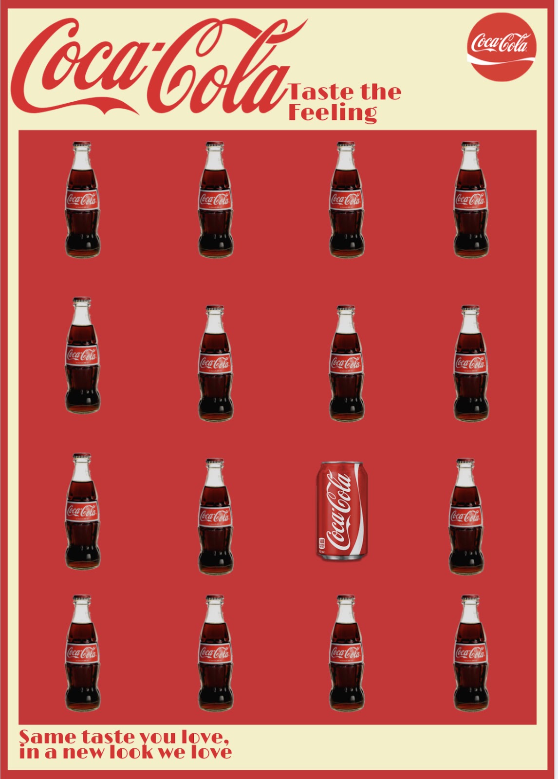
I chose to follow his first law, similarity which capitalises on something breaking the monotony of being the same and therefore drawing the audience's attention to it. I took inspiration from the Kia Soul advert as I wanted to incorporate the idea that an object breaks the typical convention of what people expect. I chose Coke as my product to market as the brand is so well known and recognizable, and aimed to focus on the duration in popularity of the product, leaning into its long standing success as a part of my advert. As I was using Coca-Cola as my product and their brand heavily relies on continuity, I chose to keep all the products in the image the same brand, demonstrating the only change was the exterior and was therefore still the same drink audiences love. This reflects the early 2000’s shift from glass bottles to cans and what audiences could expect from this. This idea was extended to the theme as I incorporated a retro style to push the narrative that although it may look different that brand recognition and notoriety remained the same.
Overall I enjoyed making this final product and am happy with the way it turned out. I believe the first law of similarity is reflected well and that the message behind the ad is easily understandable. This message is also pushed by the catchphrase I added to the bottom of the poster, ‘Same taste you love, in a new look we love’, which correlates to their slogan connoting again the success of the brand in the last few decades.
For the next part of my extended task I chose to follow Gestalt’s second law of proximity. I was inspired by the Unilever logo as the products which make up the Unilever brand were incorporated in a way that results in the letter U being made. I thought about brands which utilised multiple things to make it successful and the first one to come to find was YouTube. It’s an app made only successful by the content people put on it, leading to a wide range of things being explored on there. To begin with I chose to make use of the shape of the YouTube icon to ensure it was recognisable as a logo for their company. I started with a rough outline and went from there to begin the process of adding various shapes and graphics in which all reflected things the app was popular for. I spaced them out so that they filled in the shape enough for it to be recognisable but also that each element that went into it added to the final product, a technique which Gestalt talkies about often. Gaming and lifestyle are often considered the most popular genres so I added headphones, controllers, music and food clipart to it to get across what the platform was used for and produced. Once I had added all these in place I changed each icon's colour to red to match the marketing for YouTube and added the title below in its familiar font to finalise it. I enjoyed making this logo as I think it both reflects Gestalt's law on proximity and also what makes up the YouTube brand as I believe I've added a lot of the factors which audiences associate with the app.
For the final product I chose to use his fourth law of closure, the idea that your brain will fill in the missing parts of a design or image to create a whole, but now I have completed it, it may reflect his second law on proximity. Similarly to my YouTube logo I wanted to make a product that reflected the overall brand but still incorporate the name of the company. I couldn't quite decide what brand to go with so started to look through the random shapes available in Canva until I came across a guitar and chose to reimagine a music festival logo. I chose to use Coachella as it is so well known and edit the font into the shape of a guitar, reflecting the musical nature of the event. This made me develop my skills on Canva as I struggled for a while to get the dimensions of the design right but once I had I was happy with the outcome. I made the background green to connote the connection to nature and added the tagline to the bottom to make it feel more professional. I was inspired by the WWF logo as I wanted audiences to fill in the blanks with their mind and note the shape of the guitar made out of the word.


Comments
Post a Comment